Plain old static HTML is fine, and you can host it on a potato! Here are some design tips to keep it easy to read. None of them are objectively correct, and you are already doing some of them. They are just some suggestions as you move forward:
- Don't use dark-on-dark fonts. Use near-black on off-white or at least something high contrast.
- Break up content using horizontal rules and various headers You can style both of them in css. This keeps things easy to find and read.
- Generally, do not center-align text if it is more than one line. If you need to display blocks of text side-by-side, put each in a container then left-align the text within those containers.
- Use a bigger font than you think is strictly necessary.
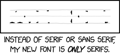
- My preference is to use sans-serif fonts. Google makes some good free ones. Sometimes I'll go back and make titles serif only.
- Resize and compress your images. A bit higher resolution than you need but with lower quality is usually better than the reverse (for jpegs)

