this post was submitted on 14 Jan 2024
1459 points (97.3% liked)
Greentext
6536 readers
642 users here now
This is a place to share greentexts and witness the confounding life of Anon. If you're new to the Greentext community, think of it as a sort of zoo with Anon as the main attraction.
Be warned:
- Anon is often crazy.
- Anon is often depressed.
- Anon frequently shares thoughts that are immature, offensive, or incomprehensible.
If you find yourself getting angry (or god forbid, agreeing) with something Anon has said, you might be doing it wrong.
founded 2 years ago
MODERATORS
you are viewing a single comment's thread
view the rest of the comments
view the rest of the comments

I'm whining cause I miss having bezels. Having a spot on the screen I can reliably touch that isn't touchscreen was nice.
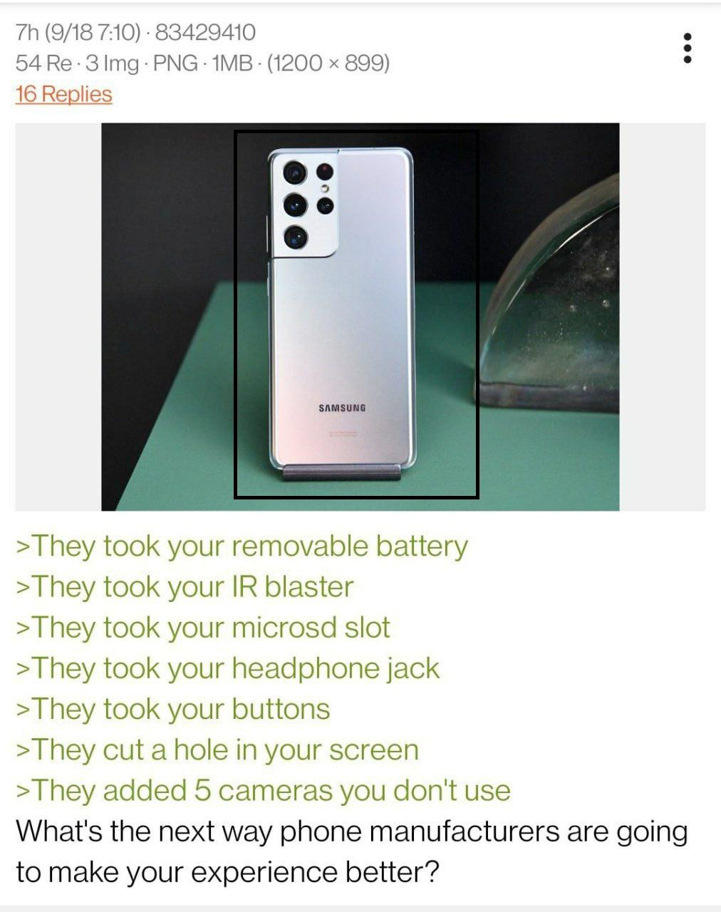
The notch is plain ugly and took away screen real estate for notifications and system icons. The pinprick ain't too bad, don't notice it much, but looks fuckbad on full-screen videos and games.
That's the point -- no it didn't.
Last phone I owned genuinely did. It could only show like three notification icons before it was filled. The pin prick is better, but I want my bezels back.
I mean, yeah you can make all kinds of bad design choices. But a simple cutout like the Pixel works just fine -- I even add a ring around it to see media/download progress, so it functions as a system icon itself.
Aight I have to admit, a progress ring around the camera is pretty cool. I still stand by my preference but that is undeniably cool and useful.