this post was submitted on 15 Jan 2025
766 points (91.3% liked)
Fediverse
41061 readers
379 users here now
A community to talk about the Fediverse and all it's related services using ActivityPub (Mastodon, Lemmy, Mbin, etc).
If you wanted to get help with moderating your own community then head over to !moderators@lemmy.world!
Rules
- Posts must be on topic.
- Be respectful of others.
- Cite the sources used for graphs and other statistics.
- Follow the general Lemmy.world rules.
Learn more at these websites: Join The Fediverse Wiki, Fediverse.info, Wikipedia Page, The Federation Info (Stats), FediDB (Stats), Sub Rehab (Reddit Migration)
founded 2 years ago
MODERATORS
you are viewing a single comment's thread
view the rest of the comments
view the rest of the comments

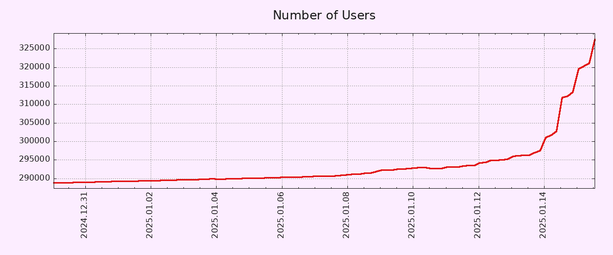
Starting the y-axis zero wouldn't change the shape of the curve at all, but it would make the increase seem less dramatic.
It's a ~10% increase, but the scale makes it look like the count shot up by 10x at first glance. I know that's why you always need to look at the axis labels, but graphs like this are purposely presented this way because they're easy to misinterpret for the average person.
It was an error on my part.