this post was submitted on 23 Nov 2023
6 points (100.0% liked)
Memes
45719 readers
1057 users here now
Rules:
- Be civil and nice.
- Try not to excessively repost, as a rule of thumb, wait at least 2 months to do it if you have to.
founded 5 years ago
MODERATORS
you are viewing a single comment's thread
view the rest of the comments
view the rest of the comments

Am not a statistician, but my understanding is predicting single events are pretty hard.
Predicting the percentage outcomes of a lot of events? That can be done.
If you're really interested...
Let's say you want to know how an ad has affected your sales since it was released 3 months ago.
You could put every single sale as a dot on a graph, but it probably wouldn't mean anything. Even if it showed the dots gradually getting higher on the chart. Was that caused by the ad or does it happen every year at the se time? What other factors could have caused this.
So I'll pause right there and say you will never know. You will never know all the forces that affect trends. You can get relatively close, but not. Does weather affect your sales? Delivery time? Internet sentiment?
So that's not very scientific, right? You need to know and control all variables to test an outcome.
Anyway, so you have a graph with dots and it may or may not mean anything. You think, ok what was last year's sales during these same 3 months?
So you get last year's data and plot the sales as dots in a different color. Now you have a graph with a ton of dots of two colors, and best case scenario: the dots for this year are higher than last year.
Is it responsible to stop there? If it were me, and my money, I'd want to make sure. So then you'd compare data from two years ago. Now you have a chart with three colors of dots.
Again, best case, this year is higher than that year too. However, as always is the case, the dots are getting difficult to understand, especially for people that don't know anything about data. You need to make things simple to digest.
So you say "I'll make an average of each month" and that will show how the averages are getting bigger, compared to previous years. Great!
So you average all the dots by month and plot them on a graph, and it looks great. But there are a few months that don't prove what you saw in the raw data. For instance, one month, two years ago, you landed a big contract and sold an astronomical number of units. So that month is the biggest one of all.
Ofuck.jpeg
Ok, no problem, you'll just remove those two data points, because they are skewing the day. Again, this is best case. Most of the time you will not be sure if these data points are errors in the data or Genuine sales. But anyway...
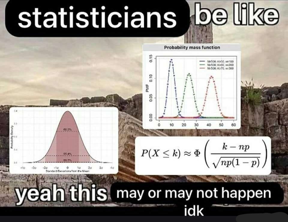
Luckily there is a method for removing "outliers" it's called standard deviation, and it's basically an equation that figures out what is an acceptable outlier and what isn't.
Again, I'll pause here to point out how unscientific this is. You are removing data because it doesn't follow the trend you want to show. And this is a perfectly acceptable practice in data analytics. And I'll point out something else, what was the affect of those contracts on your normal business sales? Did you make relatively less sales because of it? Is it responsible to completely remove those sales? Is it ethical?
And this is all very minor stuff in analytics. The more detailed the question, the more the data is "cleansed" by equations that get progressively more complicated - the more ethically vague the data is.