this post was submitted on 16 Feb 2024
787 points (98.0% liked)
Memes
52875 readers
454 users here now
Rules:
- Be civil and nice.
- Try not to excessively repost, as a rule of thumb, wait at least 2 months to do it if you have to.
founded 6 years ago
MODERATORS
you are viewing a single comment's thread
view the rest of the comments
view the rest of the comments

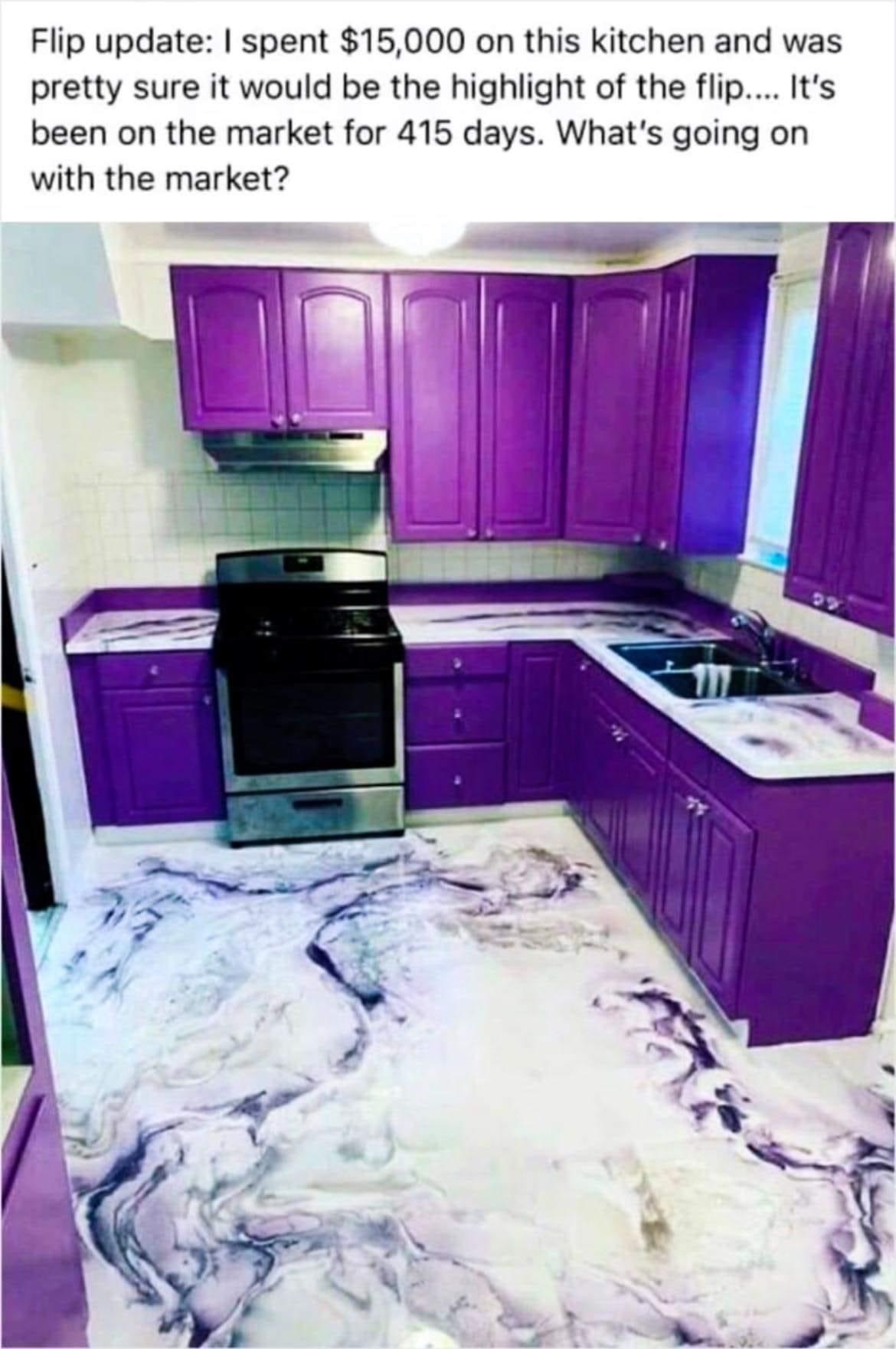
Not sure about others but I like this color scheme
It's a definite no from me. The color scheme and that floor, just no. The stove sticking out, also a definite no.
All the cupboards also seem abnormally shallow to me, as if large plates would not be able to fit in the hanging cupboards. But maybe my perspective is confused because of a larger stove than I'm used to.
For me, that entire kitchen would have to be replaced after buying. We don't know what corners this house flipper cut though, I would not trust this place to be done well.
I could... survive this layout.
But when selling a house, you want to appeal to as many as possible. And this kitchen does not have wide appeal.
And that need for wide appeal makes every house boring.
I would argue that there is many ways to preserve wider appeal w.o. it having to be boring.
Heck even in this kitchen if all that was wrong was the paint job, you can fix that in a weekend.
But it is the floor and working top, the shape of the cabinets, the poor tiling and walls, the mismatch of the cabinets and stove, the lack of appliance space, the lack of windows...
You can, but it requires more skill and more effort.
Skill and effort are often in high demand and low supply.
I kind of like it but I get exhausted looking at it for more than 5 minutes