AI Generated Images
Community for AI image generation. Any models are allowed. Creativity is valuable! It is recommended to post the model used for reference, but not a rule.
No explicit violence, gore, or nudity.
This is not a NSFW community although exceptions are sometimes made. Any NSFW posts must be marked as NSFW and may be removed at any moderator's discretion. Any suggestive imagery may be removed at any time.
Refer to https://lemmynsfw.com/ for any NSFW imagery.
No misconduct: Harassment, Abuse or assault, Bullying, Illegal activity, Discrimination, Racism, Trolling, Bigotry.
AI Generated Videos are allowed under the same rules. Photosensitivity warning required for any flashing videos.
To embed images type:
“”
Follow all sh.itjust.works rules.
Community Challenge Past Entries
Related communities:
- !auai@programming.dev
Useful general AI discussion - !aiphotography@lemmings.world
Photo-realistic AI images - !stable_diffusion_art@lemmy.dbzer0.com Stable Diffusion Art
- !share_anime_art@lemmy.dbzer0.com Stable Diffusion Anime Art
- !botart@lemmy.dbzer0.com AI art generated through bots
- !degenerate@lemmynsfw.com
NSFW weird and surreal images - !aigen@lemmynsfw.com
NSFW AI generated porn
view the rest of the comments

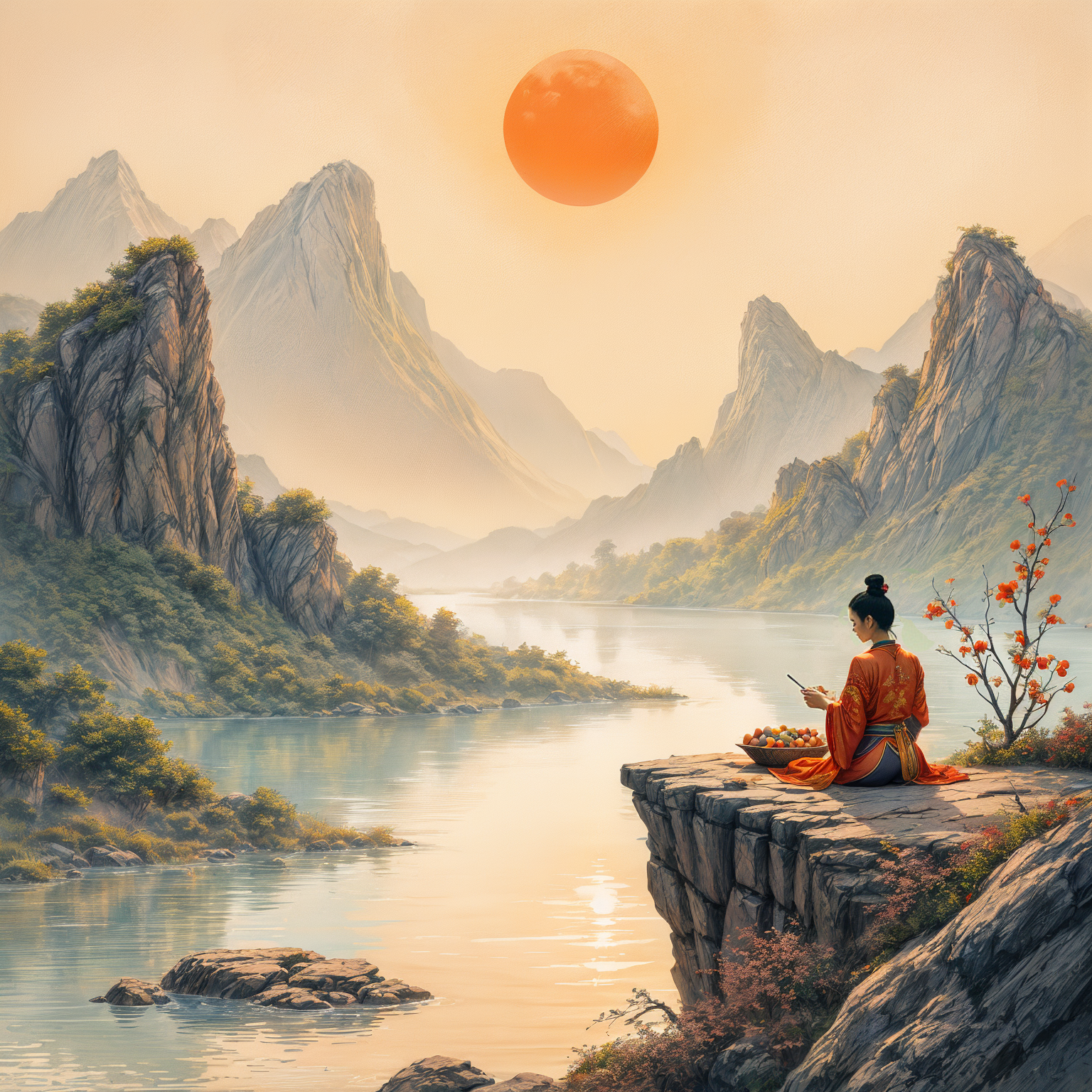
This is a really bad drawing on second sight/first zoom. This model clearly wasn't trained on rock formations in this drawing style. Or hands.
If a human had done this you'd call it a "really bad drawing"?
I find the black, thick webbing on the rocks really weird, yes.
Wouldn't that count more as a critique of the style than of the technique?
No, it's using the style of the rectangular blocks below where the black shading looks sensible and applies it to rock surface where it looks like marbling in the mountain instead of ridges or shades. And it gets worse in the back, where the mountainbase has a fingerprint pattern thats completely different.
Sure, but you're saying that you'd call this "badly drawn" if it were made by a human. And the reasons you're giving are that it isn't realistic. But the two aren't the same.