this post was submitted on 30 Oct 2024
546 points (92.8% liked)
Technology
73342 readers
3875 users here now
This is a most excellent place for technology news and articles.
Our Rules
- Follow the lemmy.world rules.
- Only tech related news or articles.
- Be excellent to each other!
- Mod approved content bots can post up to 10 articles per day.
- Threads asking for personal tech support may be deleted.
- Politics threads may be removed.
- No memes allowed as posts, OK to post as comments.
- Only approved bots from the list below, this includes using AI responses and summaries. To ask if your bot can be added please contact a mod.
- Check for duplicates before posting, duplicates may be removed
- Accounts 7 days and younger will have their posts automatically removed.
Approved Bots
founded 2 years ago
MODERATORS
you are viewing a single comment's thread
view the rest of the comments
view the rest of the comments

I recognize this may be a very autistic answer (i am)
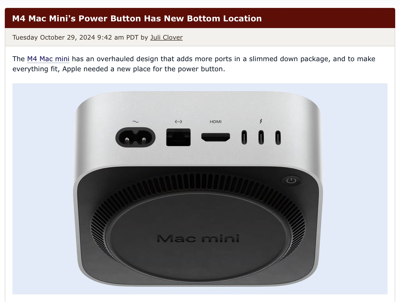
The function of a button is to be pressed, to put functionality on the bottom of a stationary device feels incredibly wrong. Thats really all there is to it.
I can forgive a reset button being on the bottom because ideally they aren’t ever pressed and you definitely don't want them accidentally pressed. I recognize that for macos a restart is usually a reset troubleshooting step and i would be probably be fine with it the button was renamed with an explanation on its actual usecase scenario.
In any regards i feel like it makes much more sense on the back where the cables go in.
I have nothing against apple besides the general capitalist/consumerism stuff. I hate google and meta much more.