this post was submitted on 19 Sep 2024
262 points (83.4% liked)
Technology
76647 readers
4457 users here now
This is a most excellent place for technology news and articles.
Our Rules
- Follow the lemmy.world rules.
- Only tech related news or articles.
- Be excellent to each other!
- Mod approved content bots can post up to 10 articles per day.
- Threads asking for personal tech support may be deleted.
- Politics threads may be removed.
- No memes allowed as posts, OK to post as comments.
- Only approved bots from the list below, this includes using AI responses and summaries. To ask if your bot can be added please contact a mod.
- Check for duplicates before posting, duplicates may be removed
- Accounts 7 days and younger will have their posts automatically removed.
Approved Bots
founded 2 years ago
MODERATORS
you are viewing a single comment's thread
view the rest of the comments
view the rest of the comments


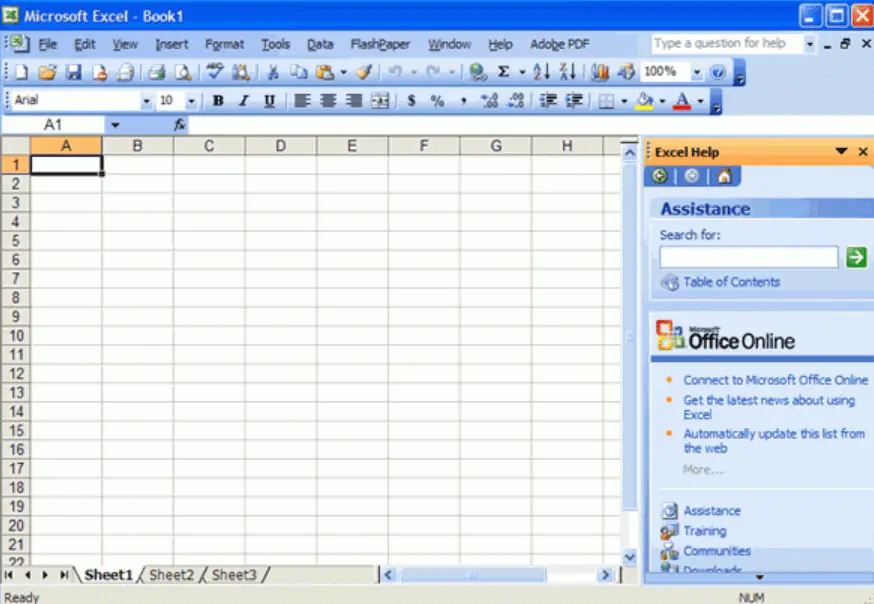
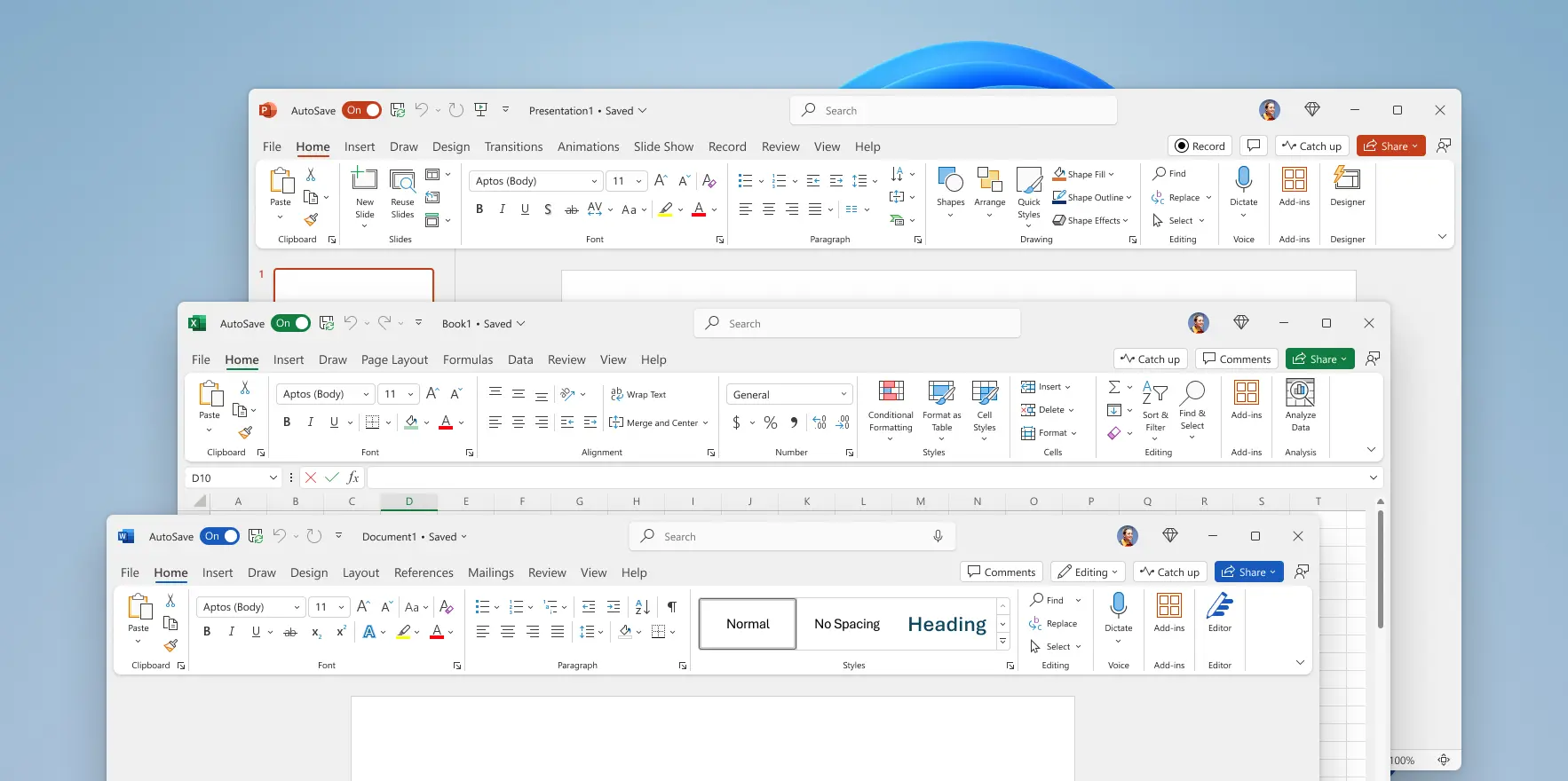
Yea, I agree that Office 2003 was the pinnacle of Office UI design. And I'd go so far as to say that about Windows 2000.
Having controls in predictable shapes and locations really contributed to "ease of use". One of my pet peeves is the more recent trend where clickable elements aren't obviously so. Such as a string of text that one has to hover across and see the cursor change shape to know that it's clickable.
As others have said, I think a significant part of why the UIs have changed since then is to accommodate touch screens and "webification".
'Glad to see your posting. I thought I was just being curmudgeonly :)
Not sure I follow, even in the example above there's many icons that are interactive but aren't enclosed in a button, do you have any other examples?
To me, buttons and icons provide the visual cue that "clicking here does something", without having to mouse over them to discover that they're clickable.
It's the unadorned text strings that aren't as obvious.