The web. It was good while it lasted.
Technology
This is a most excellent place for technology news and articles.
Our Rules
- Follow the lemmy.world rules.
- Only tech related news or articles.
- Be excellent to each other!
- Mod approved content bots can post up to 10 articles per day.
- Threads asking for personal tech support may be deleted.
- Politics threads may be removed.
- No memes allowed as posts, OK to post as comments.
- Only approved bots from the list below, this includes using AI responses and summaries. To ask if your bot can be added please contact a mod.
- Check for duplicates before posting, duplicates may be removed
- Accounts 7 days and younger will have their posts automatically removed.
Approved Bots
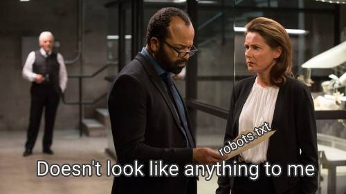
robots.txt is the perfect summary of the web era. A plain text file that politely asked web crawlers not to do certain things. Such an innocent time.

Please unblock challenges.cloudflare.com to proceed
(grumble, unblock, reload)
Verify you are human
(click)
...spin...spin......spin...
Verify you are human
(click)
...spin...spin......spin...
Verify you are human
(click)
...spin...spin......spin...
Verify you are human
(click)
...spin...spin......spin...
Verify you are human
(click)
...spin...spin......spin...
https://privacypass.github.io/ has helped somewhat
Privacy Pass will generate a number of random nonces that will be used as tokens
British people making a double take
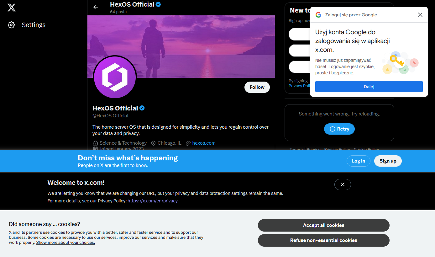
I have a very hard time believing that these companies are unaware of how auful this shit makes their webpages.
If this were a competent company, I'd say that they're entirely aware of it and how fucking awful it is, but that there's a mandate coming from somewhere that the page MUST include x, y and z and so they add x, y and z but usually try to at least make the site usable.
This being Twitter, though, I'm sure it's because a screaming man-child threw a sink at someone and told them to do it or they'll be fired and so they did it in the most half-assed obnoxious way they could manage.
It's intentional, they want you logged in so they can track what you're doing
Anyone can make a good website. It takes a real engineer to make a horrible website that people will use just enough while suffering.
I will say that the Google Auth prompt in particular is just this huge nuisance and a horrible experience. People should feel stupid for including it in their web experience.
EU: "You can't just collect people's data, you have to ask permission first and give people the opportunity to decline."
Site Developers: "Fine, but we're going to comply in the most malicious manner possible."
HEY DO YOU WANT COOKIES ARE YOU SURE PLEASE HIT THE BIG BLUE BUTTON FOR COOKIES THEY ARE HELPFUL AND GOOD PLEASE GIVE COOKIES!!!!!
It'd be fun if the EU started policing any use of the phrase "We are required to show this dialog".
They're not. They choose to show that dialog so that they can try to apply commercial tracking cookies. Anything for website function is already covered by EU laws.
There have been a couple of changes to the rule since it came into effect. Originally, the pop up could effectively occlude the "Do Not Enable Cookies" button behind a maze of "Optional" settings. The end result was a big colorful "I Consent" button and a tiny little gear button with a thousand manual checkboxes to uncheck every time you visited the site.
The regulations were updated since. Now these annoying pop-ups at least tend to have a clearly defined "Yes, I Consent" / "No, I Do Not" at equal scale and opposite color, allowing you to bypass it without going into the weeds on a configuration screen.
That screenshot looks like the old screenshots from the early browser wars with 20 toolbars stacked.
We can sell 80 percent of the screen without inducing seizures!
*without reaching statistically relevant levels of seizure induced deaths.
*without being sued for more than we would make from seizure induced deaths
The different popups just show how bad design the web is today.
Ask cookie question is required.
Login? Always create an account and proceed with all signup questions.
Agreement? Read them 1 hour until you have understood everything.
Webbrowser: can I get your location? And please the mic and video too!
Finally, don't forget the ads!
Agreement? Read them 1 hour until you have understood everything.
I one time for fun (cause I'm insane) read the entire Windows license agreement, MSA (Microsoft Services Agreement), and privacy policy. It took me 1 hour and 45 minutes, I timed it.
This kind of thing getting worse and worse at all levels of tech is increasingly pushing me to the fringes of tech solutions (with all of the handicaps that come with that) as those are getting to be the only places where this kind of thing is not pervasive.
- No apps on phone, if the mobile site doesn't work it can wait until I am in front of a desktop/laptop
- No NFC payments as that requires the phone to be blessed by lord Google or father Apple
- No set top streaming boxes on the TV, just a small Linux powered PC and a cheap Logitech wireless keyboard/trackpad
- Only Linux OSes on desktop/laptop
It took long enough but the pop-ups evolved into new pop-ups.
Did someone say... cookies?
I can just tell that whenever Twitter's user interface has weak attempts at humour, it was put there during the previous ownership, and that just makes me sad.
Like when you delete your account the final message says "#Goodbye", I was tearing up, thinking, like, shit, Musk really fucked everything up, did he?
Musk made it even worse but Twitter was already shit before Musk
Anybody know why google has a popup on every major website now? And more importantly, how to get rid of that without creating an account?
uBlock Origin Filter:
||smartlock.google.com
||accounts.google.com/gsi/$3p
||id.google.com^
||accounts.google.com/gsi/*$xhr,script,3p.
It's kind of bothersome how almost blind I am to them now. I habitually find a way to close them without having to read or focus my eyes on anything. That's not to say it isn't still an annoyance.
This is so common it has a name, it’s called banner blindness.
One of the important aspects of interface design is supposed to be not showing alerts for everything, so that when they pop up you feel compelled to pay attention.
Not long ago a nurse killed an older woman by giving her the wrong medicine; she took accountability but called out that the software they use provides so many alerts that (probably unofficial) policy was to just click through them to get to treating the patient. One of those alerts was a callout that the wrong dosage was selected and she zoomed right by it out of habit.
Another term I seen in the context of healthcare is alert fatigue:
https://en.wikipedia.org/wiki/Alarm_fatigue
Alarm fatigue or alert fatigue describes how busy workers (in the case of health care, clinicians) become desensitized to safety alerts, and as a result ignore or fail to respond appropriately to such warnings.[1] Alarm fatigue occurs in many fields, including construction[2] and mining[3] (where vehicle back-up alarms sound so frequently that they often become senseless background noise), healthcare[4] (where electronic monitors tracking clinical information such as vital signs and blood glucose sound alarms so frequently, and often for such minor reasons, that they lose the urgency and attention-grabbing power which they are intended to have), and the nuclear power field. Like crying wolf, such false alarms rob the critical alarms of the importance they deserve. Alarm management and policy are critical to prevent alarm fatigue.
Automation engineer here: alarm management is a hugely important part of making a plant operable.
It is also a project that is never done, you must always review alarms that come in and see if they are providing useful information and what the operators are supposed to do with said information.
If the operators are not supposed to do anything with the information, then what is the point of having the alarm?
The absolute lack of any kind of consistency with layout or alignment makes me cringe too.
It's just shows how they're just glued onto the page with no care or planning. Especially no consideration to the user or user experience.
Then companies like..."dont use adblock"
A porn site a friend of mine sometimes visits pops up a "sign in with Google" banner when you visit without annoyance blocker, and a "like this on Facebook" when you open a video.
